Back in July (on a day as grey as yesterday. But not as cold…) I was taking a break in Frei-Weinheim at the Ingelheim-Oestrich-Winkel ferry ramp. Just over 20km from home, 50-ish km to go, time for a banana and a power bar.
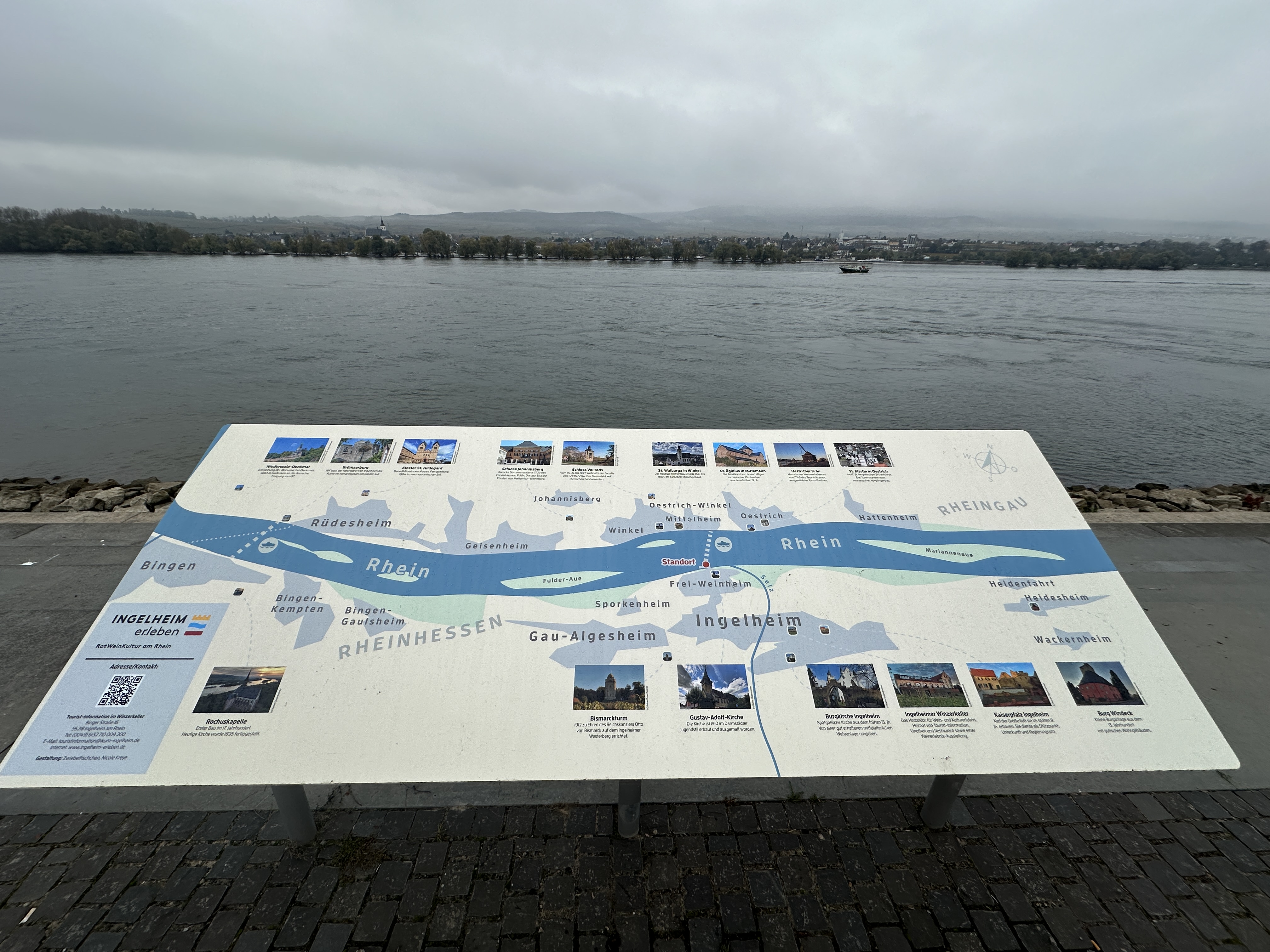
A young woman approaches me – thought my luck had changed for a sec – and asks me if I’d ever looked at the information display (below) and what do I think of it.
Yes I have and it’s about as much use as a chocolate teapot. Or tits on a bull (No, I didn’t say that. Who, me…?)
“That’s interesting “she said, “because I’m a graphic designer* and I’ve got the job of designing a new one. My name’s Nicole Kreye, by the way”
*Her agency is called Zwiebelfischen – onion fish -, which is printers’ slang dating back to the manual typesetting era for a single letter of incorrect font or size that slips into the text and the first thing you’ll see as a reader.
And her tag-line is “With ideas that go beyond the conventional. Ideas that immediately catch the eye.”
So we started talking about what information a visitor to the site could reasonably expect, the philosophy of design (I’m a big fan of simplification (a la the London Underground map) and the use of icons. Etc.
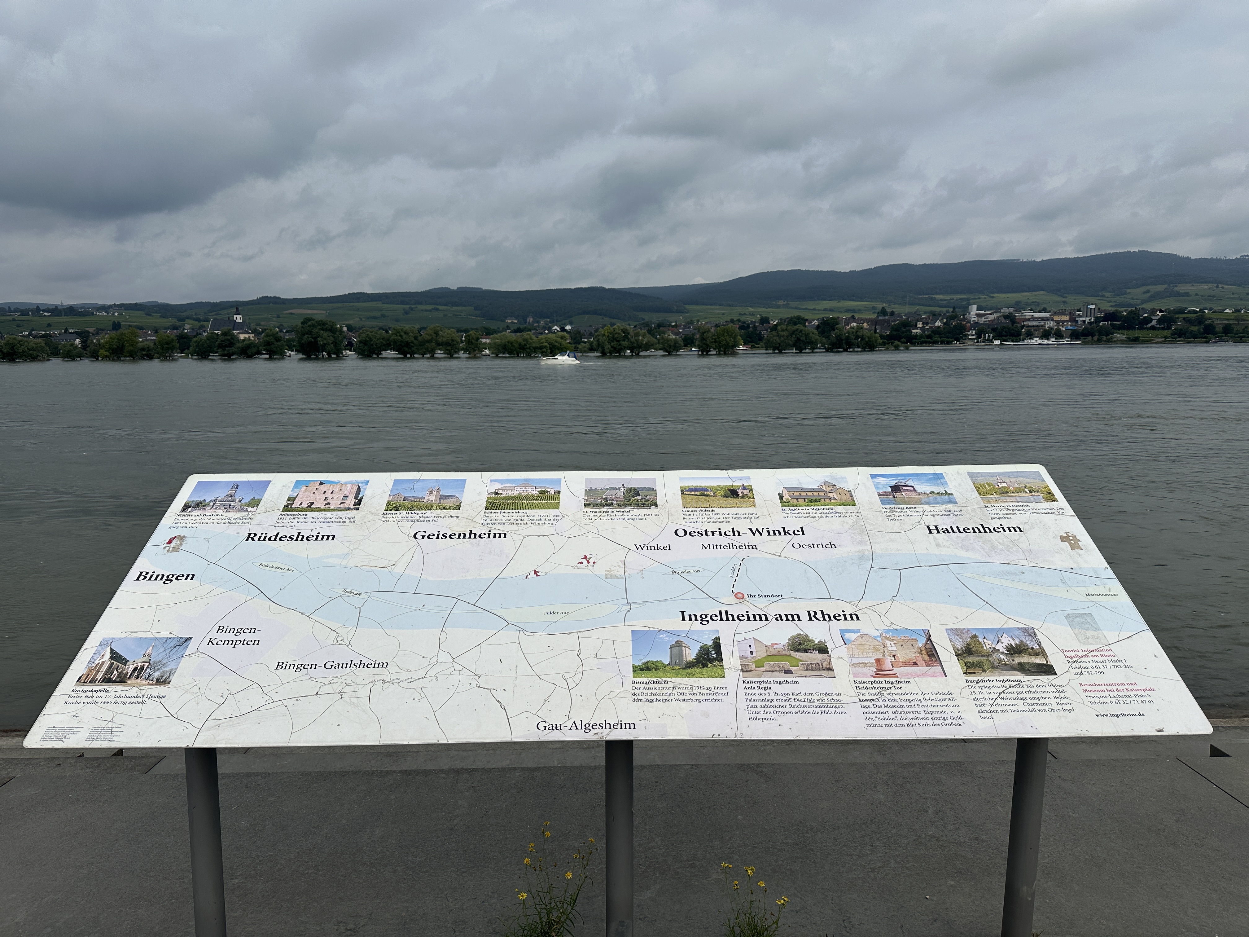
And this is what she came up with.
The one at the top.
It shows the map orientation, named outlines of urban zones, thumbnail location markers of significant sites (2 more than on the original display) graphically linked to larger images with text.
And a QR link to Ingelheim’s tourist website.
This is seriously good stuff and when I see a product as classy as this, I’m always reminded of Keith Richards – cool as a cucumber – and Ronnie Wood – out of his head as usual – doing a TV spot for MTV.
“Trust a pro…”

Thanks for the nice blog article. I was very pleased