>
The wine from Rheinhessen is saddled with a shockingly bad reputation.
It’s the largest wine-growing region in Germany and they’ve pumped out some dire stuff over the years – Blue Nun (“saddled with a label that read “naff” in purple Day-Glo letters”, someone wrote..), Black Tower (sold in cans at one stage. Bloody hell!), Liebfraumilch and whathaveyou.
So it’s an uphill battle, especially when you’ve got the Rheingau just across the river and the Moselle down the road, both of which regions serve a more discerning market.
And they’ve got the landscape to go with it, too.
But a marketing outfit came up with the idea closing the capital on bulk production (not that it still doesn’t go on – you just don’t talk about it…) and instead focussing on the new generation of young vintners – kids that have taken over the family business, studied Business Management and gone all over the world on internships, bringing back new ideas and putting them into practice.
The print campaign featured b/w images of aforementioned young vintners (not actors; I recognised at least 5 of them) in their courtyards or out in the vineyards.
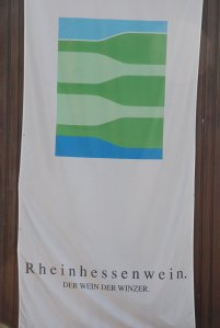
And the logo they’ve developed is just inspired – stacked bottle shapes, with the Rhine at the bottom, interleaved vineyards and the sky above.
Tops

>That is a nice design. Now they just have to deliver on the promise! I remember when Blue Nun first appeared on the shelves – it elicited all sorts of rude jokes.